SVG Stroke Animation and Path Morphing: Techniques and Constraints
There's a stubborn misconception in the frontend world: "SVG animation is just making icons spin and change color, right?"
Brother. Those slick website intro animations you've seen — a logo being traced out stroke by stroke as if drawn by an invisible hand, data chart lines "growing" along their curves, SVG illustrations materializing from nothing as you scroll down the page — nearly all of these are powered by advanced SVG animation. And the core techniques behind them? Strip away the theatrics and you're left with exactly two things: stroke-dashoffset line drawing and path morphing.
Our existing "SVG Animation Pitfalls" article already covered lifesaving tricks like transform-box: fill-box. This one skips the basics. We're going straight to the advanced stuff — the techniques that make interviewers lean forward, that make users freeze and stare at your screen for three seconds. Let's tear them apart.

SVG stroke animation makes any stroked shape appear to be "drawn" in real-time — something bitmap images and video can never achieve. Every frame is controlled by precise dashoffset values.
The Core Principle of Stroke Animation: What You See as "Drawing" Is Actually "Revealing"
The logic behind this technique is deeply counterintuitive. You think the browser is appending path segments frame by frame — it's not. What the browser actually does: it draws the entire line first, then hides it using a clever CSS property, and reveals it piece by piece through animation.
That property is stroke-dasharray.
Understanding stroke-dasharray is the key that unlocks all SVG stroke animation. It defines a dash pattern — you specify alternating lengths of solid stroke and gap:
stroke-dasharray: 10, 5;   /* 10px dash + 5px gap, repeating */
stroke-dasharray: 20;      /* 20px dash + 20px gap (single value = equal gap) */
stroke-dasharray: 500;     /* 500px dash + 500px gap */
Now set stroke-dasharray to the exact total length of the path. You get one solid dash that precisely covers the entire path, followed by an equal-length gap — but since the gap begins exactly where the path ends, visually you see a continuous solid line.
The magic happens with the second property: stroke-dashoffset. It shifts the starting position of the dash pattern.
stroke-dashoffset: 0;    /* Pattern starts at beginning → stroke fully visible */
stroke-dashoffset: 500;  /* Pattern pushed forward 500px → solid portion pushed out of view → completely invisible! */
This is the moment your eyes get deceived. You use JavaScript to get the path's true length, set both dasharray and dashoffset to that length — the entire line "magically disappears." Then you animate dashoffset from the full length down to 0 — and the line appears to draw itself from the start:
// Get the true path length (this is the foundation of the entire animation)
const path = document.querySelector('#my-line');
const length = path.getTotalLength();  // returns e.g. 847.3

// Set initial state: the entire line is "hidden"
path.style.strokeDasharray = length;
path.style.strokeDashoffset = length;
path.style.transition = 'stroke-dashoffset 2s ease-in-out';

// Trigger the animation: offset goes to zero → line appears to "draw"
requestAnimationFrame(() => {
  path.style.strokeDashoffset = 0;
});
Three lines of key code. No external libraries, no convoluted logic — just leveraging the browser's native SVG dash rendering to pull off an optical illusion. But this illusion is extraordinarily powerful — because it operates on a CSS property, it works with @keyframes, with transition, with requestAnimationFrame for precise frame control, and even with SMIL <animate> tags for declarative definition.
Why You Must Use getTotalLength()
You might think: can't I just eyeball the path length and plug in a rough number? Like stroke-dasharray: 800?
No. Insufficient precision causes two problems. Undershoot — the animation finishes before the line is fully drawn, leaving a "decapitated" stub at the endpoint. Overshoot — after the animation completes, a residual gap keeps pushing forward, causing the line to visually "flicker" at the end.
getTotalLength() returns the precise arc length of the path in the SVG coordinate system, accounting for all Bézier curve segments. This is why you must use JavaScript to fetch this value — CSS alone has no ability to compute the arc length of an arbitrary SVG path.
For responsive scenarios (SVG dimensions change with the viewport), the path length changes too. Remember to recalculate on resize:
window.addEventListener('resize', () => {
  const newLength = path.getTotalLength();
  path.style.strokeDasharray = newLength;
  path.style.strokeDashoffset = newLength;
});
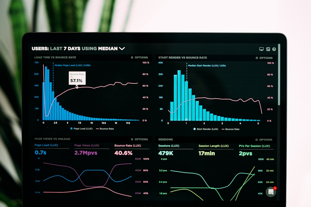
Dynamic data visualization charts are among the most common applications of SVG animation. Every growing curve and rising bar chart relies on the precise coordination of dasharray and dashoffset behind the scenes.
Three Implementation Approaches: CSS, JS, and SMIL — Which to Choose
Pure CSS @keyframes: Simplest but Limited
If your path length is fixed (like a logo at a specific size), you can hardcode the length directly in CSS:
.logo-path {
  fill: none;
  stroke: #3b82f6;
  stroke-width: 2;
  stroke-linecap: round;        /* rounded endpoints */
  stroke-linejoin: round;       /* smooth corners */
  stroke-dasharray: 847;        /* path length (known in advance) */
  stroke-dashoffset: 847;
  animation: draw-line 2s ease-in-out forwards;
}

@keyframes draw-line {
  to { stroke-dashoffset: 0; }
}
forwards is critical — without it, dashoffset snaps back to its initial value when the animation ends, and your line vanishes instantly. That's embarrassing.
The pure CSS approach offers zero JS dependencies and lets the GPU handle the stroke-dashoffset transition. The downside: the path length must be baked into the CSS, so it breaks if your SVG needs to scale responsively.
JavaScript Dynamic Trigger: Most Flexible, Production-Ready
The JS snippet above is the production go-to. Its strengths: path length is dynamically acquired, animation can be triggered at any moment (page load, scroll-into-viewport, user click), and you get precise control over multi-path timing.
A common pattern chains multiple path animations — letters "written" one after another:
const paths = document.querySelectorAll('.handwriting-path');
paths.forEach((path, index) => {
  const length = path.getTotalLength();
  path.style.strokeDasharray = length;
  path.style.strokeDashoffset = length;
  path.style.transition = `stroke-dashoffset 0.6s ${index * 0.15}s ease-out`;
  // Each path delayed by index × 0.15s → letters appear sequentially
});

// Once all paths are ready, fire them together
requestAnimationFrame(() => {
  paths.forEach(p => p.style.strokeDashoffset = '0');
});
The result: text that looks like someone is writing it stroke by stroke. This exact technique powers the hero sections of countless brand websites.
SMIL <animate>: Native but Deprecated
SMIL (Synchronized Multimedia Integration Language) is SVG's built-in declarative animation tag, embedded directly inside the SVG markup:
<path d="M10,80 Q95,10 180,80" fill="none" stroke="#333" stroke-width="3"
      stroke-dasharray="200" stroke-dashoffset="200">
  <animate attributeName="stroke-dashoffset"
           from="200" to="0"
           dur="1.5s"
           fill="freeze"
           begin="0s" />
</path>
The benefit: no CSS or JS required. The animation definition is fully self-contained within the SVG file. You can use it as an <img>, as a CSS background image, even embed it in an email — and the animation still runs.
The reality: Chrome completely removed SMIL support in 2025. Safari and Firefox still have it, but nobody knows for how long. Unless you're building an SVG for a specific, controlled environment (like an animated logo in email), don't use SMIL in new projects.

When you write an elaborate SMIL animation, open it in Chrome, and nothing moves — you'll miss the days when SMIL worked.
Advanced Practice: From Single Line Drawing to Complete Visual Narrative
Once you've mastered the fundamentals, what separates good from great is the ability to compose these basic animations into cohesive, narrative-driven motion.
Loading Progress Ring
The most common application of stroke animation: a ring filling from 0% to 100%. The key trick is setting dasharray to the circumference (not the full length this time), then animating dashoffset:
.progress-ring {
  fill: none;
  stroke: #3b82f6;
  stroke-width: 6;
  stroke-linecap: round;
  /* Circumference = 2πr = 2 × 3.14159 × 45 ≈ 282.7 */
  stroke-dasharray: 282.7;
  /* Initial offset 282.7 → progress 0%; offset 0 → progress 100% */
  stroke-dashoffset: 282.7;
  transition: stroke-dashoffset 0.3s ease;
}
Calculate dashoffset dynamically based on the actual progress value:
function setProgress(percent) {
  const circumference = 2 * Math.PI * 45;  // circle circumference
  const offset = circumference - (percent / 100) * circumference;
  ring.style.strokeDashoffset = offset;
  // percent=0   → offset=circumference → completely empty
  // percent=100 → offset=0              → full ring
}

setProgress(75);  // ring fills to 75%
Different stroke-linecap values affect the ring's visual style: round gives rounded ends suitable for Modern UI; butt gives flat ends suitable for Dashboard styles.
Marching Ants (Flowing Dashed Border)
The marching ants effect (think Photoshop's selection marquee) is essentially short dashes plus continuously changing dashoffset:
@keyframes marching-ants {
  to { stroke-dashoffset: -20; }  /* negative value → "flows forward" */
}

.marching-border {
  stroke-dasharray: 10, 5;  /* 10px dash + 5px gap */
  animation: marching-ants 0.5s linear infinite;
}
Flip the direction with to { stroke-dashoffset: 20; } for reverse flow. This effect is excellent for image crop selections, map boundary highlights, and similar use cases.
Handwriting Signature Animation
Many brand websites feature a "handwritten signature" animation in the hero area — the word "Signature" rendered as an SVG path, drawn stroke by stroke.
Technical recipe:
- Use Illustrator / Figma to convert text to outline paths (Outline Stroke)
- Export as SVG, ensuring each letter/stroke is an independent
<path> - Arrange paths in writing order, calculate each path's length
- Chain animations with JS — first path completes, second begins, simulating real writing rhythm
Stroke width variation (pressure sensitivity) can be expressed in static SVG through path shape, but for animation we can only control stroke-width — layer a stroke-width @keyframes on top of the stroke animation to simulate thin starts and thick strokes:
@keyframes write-with-pressure {
  0%   { stroke-dashoffset: var(--len); stroke-width: 1; }
  30%  { stroke-width: 3; }
  70%  { stroke-width: 3; }
  100% { stroke-dashoffset: 0; stroke-width: 1; }
}
This level of detail is the difference between "good" and "stunning."
Path Morphing: Watch Shapes Transform Before Your Eyes
Stroke animation controls "stroke visibility." Path morphing controls "shape transformation" — a circle becoming a square, a triangle becoming an arrow, the letter A becoming the letter B.
The core operation of path morphing: animating the d attribute of a <path> element.
The d attribute defines a path's shape — M moves to, L draws a line, C draws a cubic Bézier curve, Q draws a quadratic Bézier curve. If the start and end shapes have identical path structures (same command types, same number of points), the browser can smoothly interpolate between the two d strings.
CSS d Attribute Animation (Well-Supported by 2026)
A few years ago, the d attribute was off-limits for CSS animation — browsers could only animate "presentation attributes" like fill, stroke, and opacity, not "geometric attributes" like d. But starting in 2024, major browsers progressively added support for CSS d attribute animation:
.morph-shape {
  /* Circle → square → circle */
  animation: morph 3s ease-in-out infinite alternate;
}

@keyframes morph {
  0% {
    d: path("M50,10 A40,40 0 1,1 49.9,10 Z");  /* approximate circle */
  }
  100% {
    d: path("M15,15 L85,15 L85,85 L15,85 Z");   /* square */
  }
}
The fatal requirement: the start and end paths must contain exactly the same number and types of commands. If one path has 4 points and the other has 8, the animation won't error out — but the transition will look bizarre, with the browser producing unpredictable intermediate shapes. This is the most common pitfall in path morphing.
The Point-Matching Rule
Suppose you want to morph a triangle into an arrow. A triangle might have only 3 vertices, but an arrow needs 7. Morphing directly will fail. The correct approach: sneak extra points into the triangle path — these points overlap existing vertices, so the triangle looks unchanged, but its path structure now matches the arrow:
Triangle (visually 3 points, actually 8 to match the arrow):
M50,80 L85,20 L15,20 L15,20 L15,20 L15,20 L15,20 Z

Arrow (8 points):
M15,40 L50,15 L85,40 L70,40 L70,70 L30,70 L30,40 Z
Both paths now have the same command count, and the morphing will be smooth. In the SVGDO editor, you can edit the d attribute directly in code view to adjust path point counts.
Scroll-Driven SVG Animation: Turning the Scroll Wheel into a Timeline
Scroll-driven animation is one of the hottest frontend trends of 2025–2026. The core concept: every pixel the user scrolls equals one frame of animation progress.
IntersectionObserver: The Most Stable Approach
IntersectionObserver can precisely detect when an element enters or leaves the viewport. The traditional usage is boolean — trigger animation on entry. But we can use intersectionRatio (the element's visible fraction) to map scroll position directly onto animation progress:
const svgIllustration = document.querySelector('#animated-illustration');
const paths = svgIllustration.querySelectorAll('.draw-on-scroll');

// Initialize stroke animation parameters for all paths
paths.forEach(path => {
  const len = path.getTotalLength();
  path.style.strokeDasharray = len;
  path.style.strokeDashoffset = len;
});

const observer = new IntersectionObserver((entries) => {
  entries.forEach(entry => {
    // entry.intersectionRatio: 0 (fully hidden) → 1 (fully visible)
    const progress = Math.min(1, Math.max(0, entry.intersectionRatio));

    paths.forEach(path => {
      const len = parseFloat(path.style.strokeDasharray);
      // Reverse-calculate dashoffset from scroll progress
      path.style.strokeDashoffset = len * (1 - progress);
    });
  });
}, {
  threshold: Array.from({ length: 101 }, (_, i) => i / 100)
  // Fire callback every 1% change → animation follows scroll smoothly
});

observer.observe(svgIllustration);
The effect: as the user scrolls down, the SVG lines "draw themselves" in lockstep with the scroll position. Scroll faster, the drawing accelerates. Scroll back up, the lines retreat. This is an incredibly powerful narrative tool — perfect for product landing pages, data reports, annual recaps, and any "reveal-as-you-read" experience.
Performance Note
Don't set 101 threshold breakpoints and then call getTotalLength() on every path inside each callback. Compute all path lengths once during initialization, store them in a Map, and let the scroll callback do pure arithmetic (length * (1 - progress)) — zero DOM measurement API calls.
Performance Optimization: Don't Let Your Animations Become a Slideshow
Rule One: Only Animate transform and opacity
The browser renders a frame in five stages: JavaScript → Style → Layout → Paint → Composite.
transformandopacityanimations only need the Composite stage — the GPU compositor handles them on the compositor thread, completely bypassing Layout and Paint.stroke-dashoffsetneeds the Paint stage, but not Layout.- Animating
width,height,top,leftrequires all five stages — relayout, repaint, recomposite on every frame. This is a performance disaster.
So the optimal strategy: use stroke-dashoffset for stroke animation (Paint only, acceptable), use transform: translate() scale() for position and size changes (Composite only, ideal), and never animate layout properties.
Rule Two: Limit Simultaneously Animated Elements
Fifty CSS animations running at once on a page might look fine on your dev machine, but frame rates will crater on low-end phones. The real-world threshold is around 30 elements (varies by animation complexity and device).
Solution: only animate elements in the viewport. Use IntersectionObserver to detect which elements are visible — remove the animation class from off-screen elements and pause their animations. Users can't see off-screen animations anyway, so pausing them costs nothing but yields significant performance gains.
Rule Three: Use will-change Correctly
will-change: stroke-dashoffset tells the browser: "this property is about to be animated — prepare optimization resources in advance." But it's not free — the browser allocates an extra GPU memory layer for every element with will-change. Use it too liberally, and GPU memory fills up, making everything slower.
The correct pattern: add will-change before animation starts, remove it when animation ends.
.animate-in {
  will-change: stroke-dashoffset;
  animation: draw-line 2s ease-out forwards;
}

.animate-done {
  will-change: auto;  /* free GPU resources */
}
Rule Four: Respect "Reduce Motion" Preferences
Operating systems have a "Reduce Motion" (prefers-reduced-motion) accessibility setting. Some users enable it due to vestibular disorders (motion sensitivity). As a developer, you must respect this:
@media (prefers-reduced-motion: reduce) {
  *, *::before, *::after {
    animation-duration: 0.01ms !important;
    animation-iteration-count: 1 !important;
    transition-duration: 0.01ms !important;
  }
}
Note: we're not setting animation: none — we're compressing animations to near-instantaneous. This way, information conveyed through animation (like a progress ring's final state) isn't lost, but users don't experience the motion.
But there's a catch — @media (prefers-reduced-motion) only works when the SVG is inline in the HTML document. If you use the SVG as <img src="animated-logo.svg">, the SVG file's internal @media rules are sandboxed by the browser and cannot read the host page's user preferences. If you care about accessibility (you should), critical animated SVGs must be inlined.
Technology Selection Decision Matrix
After all this analysis, the right approach for each scenario is clear:
| Scenario | Recommended Approach | Rationale |
|---|---|---|
| Icon hover micro-interactions | CSS transition | Zero code weight, GPU-accelerated, sub-200ms |
| Logo reveal stroke animation | JS + stroke-dashoffset | Flexible timing control, responsive path lengths |
| Scroll-narrative SVG motion | IntersectionObserver + JS | Scroll progress precisely coupled to animation progress |
| Complex multi-path timelines | WAAPI or GSAP | CSS @keyframes struggles with complex sequencing |
| Animated SVG in email | SMIL <animate> |
Self-contained, no external CSS/JS needed |
| Designer-authored complex animation | Lottie | Direct After Effects export, no hand-coding |
| Page background decorative animation | CSS @keyframes | Simple, GPU-accelerated, stays off the main thread |
| Data visualization dynamic charts | JS + requestAnimationFrame | Precise frame-level control and data binding |
No single approach is "the best" — only the best fit for the current scenario. Most projects mix 2–3 approaches: CSS for micro-interactions, JS for stroke animations, GSAP for complex timelines.
Putting It Into Practice with SVGDO
Once you understand the principles, putting them into practice in the SVGDO editor (svgdo.com) is fast.
Open the editor, import your SVG — it could be an icon exported from Figma/Illustrator, or handwritten path code. Switch to Split View: the left side shows the visual canvas, the right side shows the live code — any stroke-dasharray and stroke-dashoffset you write on the right is immediately visible on the left.
For stroke animation, the core workflow is:
- In code view, use
querySelectorAllto select all<path>elements you want to animate - Open the browser console, run
getTotalLength()to get each path's length - Write the length values into each element's
stroke-dasharrayandstroke-dashoffset - Write your
@keyframesortransitionin CSS - Switch to preview mode and watch the magic
For path morphing, SVGDO's code editor features syntax highlighting — you can visually compare the command structures of two d strings to ensure point counts match.

Debugging SVG animations in a real development environment: write code on one side, watch the live preview on the other. Change a single dashoffset value and see the stroke animation progress instantly.
If the preceding few thousand words were the theory lecture, opening SVGDO and building it yourself is the lab session. Stroke animation is one of those things where you understand the principle in ten minutes of reading, but the moment you actually watch a Bézier curve go from "gone" to "fully drawn" — that involuntary "whoa" you let out? That's the real magic of SVG.